Insights into data
How to Interpret Box Plots
A box plot gives us a visual representation of the quartiles within numeric data. The box plot shows the median (second quartile), first and third quartile, minimum, and maximum. The main components of the box plot are the interquartile range (IRQ) and whiskers.
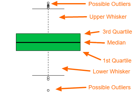
What is the interquartile range (IRQ) of a box plot?
The interquartile range IRQ of a box plot is a visualization of the range from the first quantile to the third quantile. The outer lines of the IRQ show the first and third quartiles, so if you are looking at the lower half of the data, then the edge of the IRQ, where the IRQ and whisker meet, is approximately one half of the lower half of the data. In other words, the first quartile is the median of the lower half of the data.
What are box plot whiskers?
In the default R package, the top whisker shows the smaller of two values, one possible value is the maximum value, and the other possible value is the third quantile + 1.5 times IRQ. The bottom whisker shows the larger of two values, one possible value is the minimum value, and the other possible value is the first quantile minus 1.5 times the inter-quantile range.
How to interpret a box plot?
A box plot gives us a basic idea of the distribution of the data. IF the box plot is relatively short, then the data is more compact. If the box plot is relatively tall, then the data is spread out. The interpretation of the compactness or spread of the data also applies to each of the 4 sections of the box plot.
With a loose definition of outliers, you could use the chart to identify the possible existence of outliers. With large data points, outliers are usually expected. For example, 100 or more data points with a normal distribution commonly have some outliers.
The box plot is also useful for evaluating the relationship between numeric data (continuous data) and categorical data (finite data). The following plot shows two box plots. The plot shows two box plots, one for category 1 and the other for category 2. Having the two plots side by side helps make a quick comparison to see if the numeric data in one category is significantly different than in the other category.
dataNorm = rnorm(1000)
dataLogNorm = rlnorm(100)
primaryColor = rgb(0.0,0.73,0.27)
secondaryColor = rgb(1,0.17,0)

cat1=sample(2:24, 20 , replace=T)
cat2=sample(4:14, 8 , replace=T)

C=list(cat1,cat2)

names(C)=c(paste("Category 1\n n=" , length(cat1) , sep=""), paste("Category 2\n n=" , length(cat2) , sep=""))

par(mgp=c(3,2,0))

boxplot(C , col=c(primaryColor, secondaryColor), ylab="value" )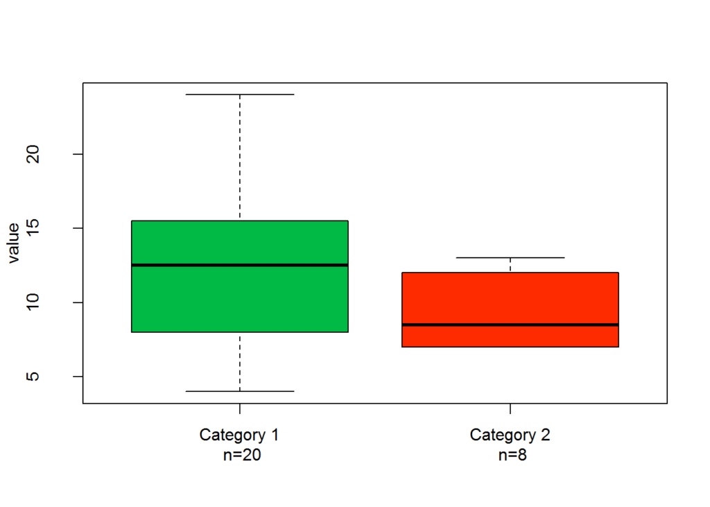
The following plot shows a boxplot of data with a normal distribution and a box plot of data with a log normal distribution. The plots show that the distribution between the data points is different. The first and second quartiles are very short compared to the first and second quartiles of the normal distribution example, and compared to the third and fourth quartile of the log normal distribution.
combinedData = list(dataNorm, dataLogNorm)

names(combinedData) = c("Normal Dist", "Log Normal Dist")

boxplot(combinedData, col = c(primaryColor, secondaryColor) )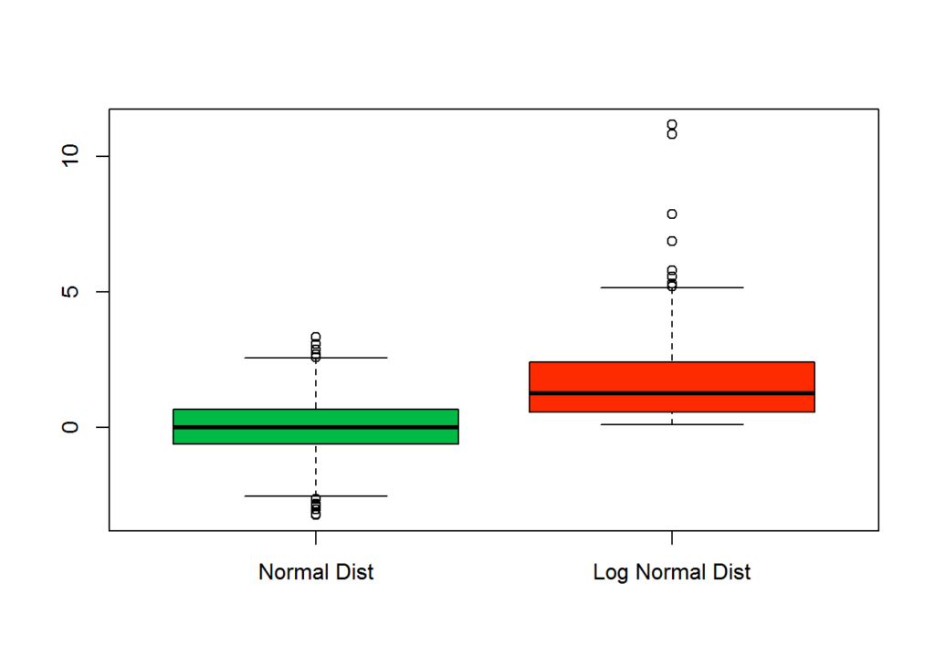
The following plot shows a histogram and a boxplot of the same data to help understand the box plot and how the data is divided into quartiles.
par(mar=c(3.1, 3.1, 1.1, 2.1))
hist(dataLogNorm, col = primaryColor, breaks = 50)
boxplot(dataLogNorm, horizontal=TRUE, col = secondaryColor,  outline=TRUE, add = TRUE)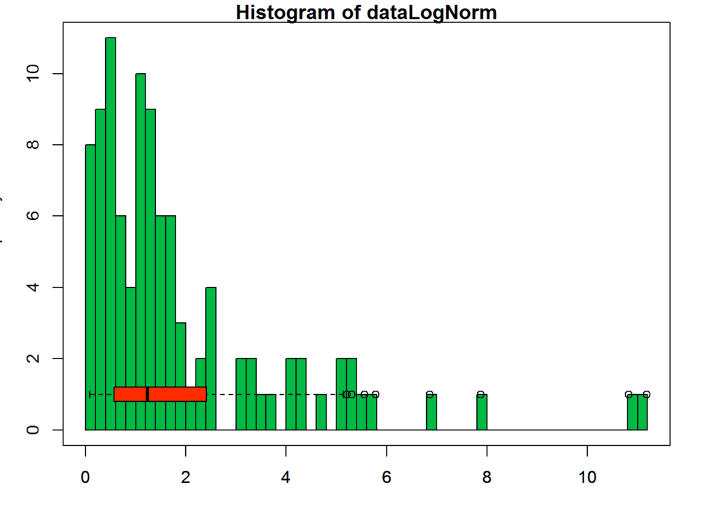
Box plots do not display all statistics needed to determine the distribution. For example, if we were looking at just the box plot of the following data set, we wouldn’t be able to tell if the distribution of the data is centered about two points or pretty much spread even across the data range.
distExampleData=c(rnorm(1000 , 0 , 1.5) , rnorm(1000 , 9 , 1.5))

layout(mat = matrix(c(1,2),2,1, byrow=TRUE),  height = c(1,8))

# Draw the boxplot and the histogram
par(mar=c(0, 3.1, 1.1, 2.1))
boxplot(distExampleData , horizontal=TRUE , ylim=c(-10,20), xaxt="n" , col=primaryColor , frame=F)
par(mar=c(4, 3.1, 1.1, 2.1))
hist(distExampleData , breaks=40 , col=secondaryColor , border=F , main="" , xlab="value of the variable", xlim=c(-10,20))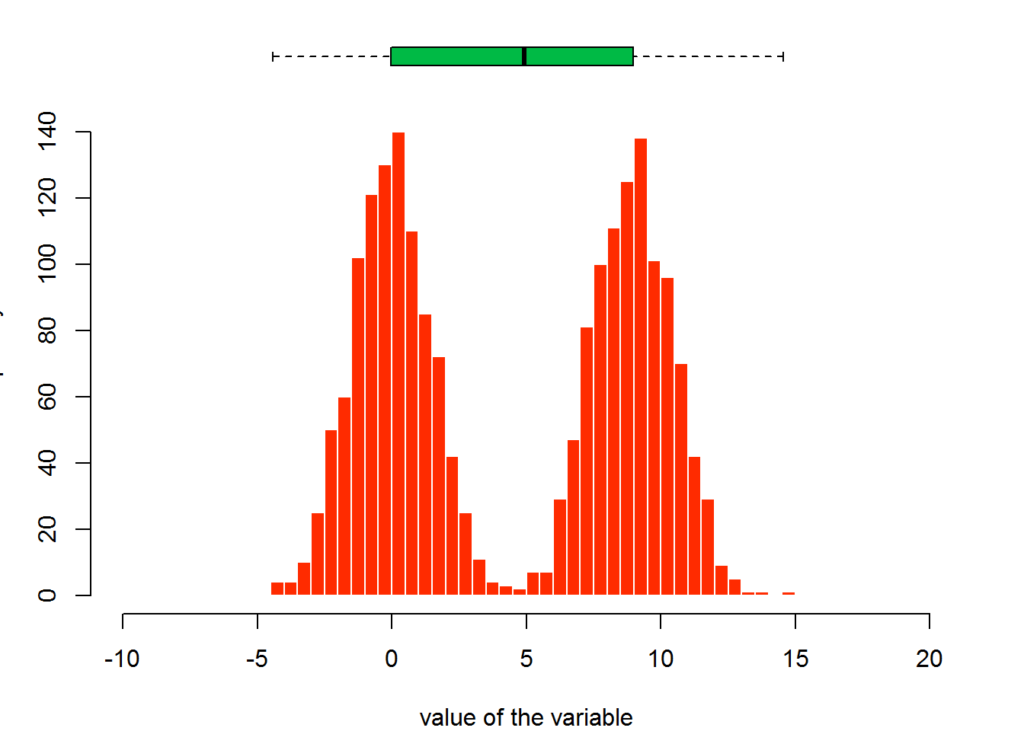
The following plot shows a very similar box plot but with an entirely different distribution.
# Creating data
uniDistExampleData=c(runif(1000 , min = min(distExampleData) , max = max(distExampleData)) )

layout(mat = matrix(c(1,2),2,1, byrow=TRUE),  height = c(1,8))

par(mar=c(0, 3.1, 1.1, 2.1))
boxplot(uniDistExampleData , horizontal=TRUE , ylim=c(-10,20), xaxt="n" , col=primaryColor , frame=F)
par(mar=c(4, 3.1, 1.1, 2.1))
hist(uniDistExampleData , breaks=40 , col=secondaryColor , border=F , main="" , xlab="value of the variable", xlim=c(-10,20))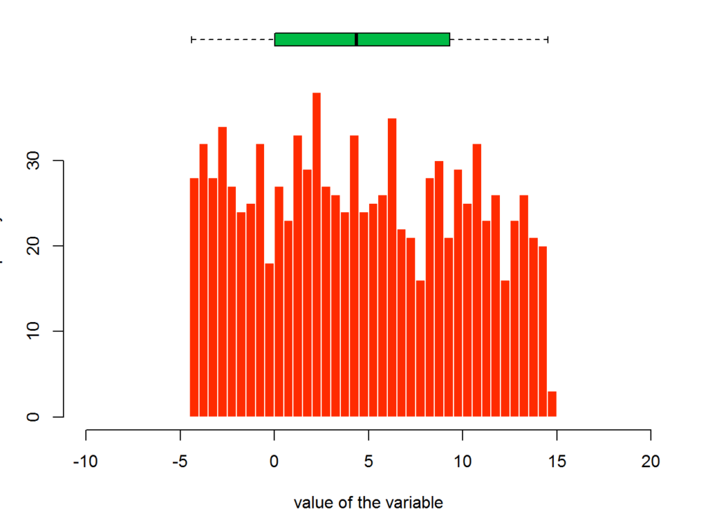
Box plots are only one tool at your disposal for becoming familiar with your data, but it is a tool that is informative. You can read more about the different types of box plots and variations at https://en.wikipedia.org/wiki/Box_plot
Justin Nafe December 26th, 2016
Posted In: Visualizations